overview
client valkyrie | when fall 2020 | my role digital designer | objective update branding including logotype | programs used illustrator + sketch + principle + adobe xd
above is a video of the final prototype with the updated branding and logo; it is a walkthrough of a couple pages on the website
problem
brief valkyrie sought to revamp their logotype, color palette, and website to more accurately reflect their brand strategy. as a consulting firm specializing in ai-driven solutions, they aimed to adopt a bimodal approach in their branding.
challenge their bimodal approach, rooted in human-centered solutions paired with advanced scientific methodologies, presented a unique challenge. i needed to visually articulate the contrast between artificial intelligence and human nature, creating a cohesive brand identity that seamlessly blends these two elements.
solution
after delving into the brand strategy through a mood board, i conceptualized comprehensive brand guidelines including the logo, color palette, image treatment, and typography. to demonstrate these guidelines in action, i created high-fidelity mockup images of the website (three screens) and developed a short interactive prototype.
mood board
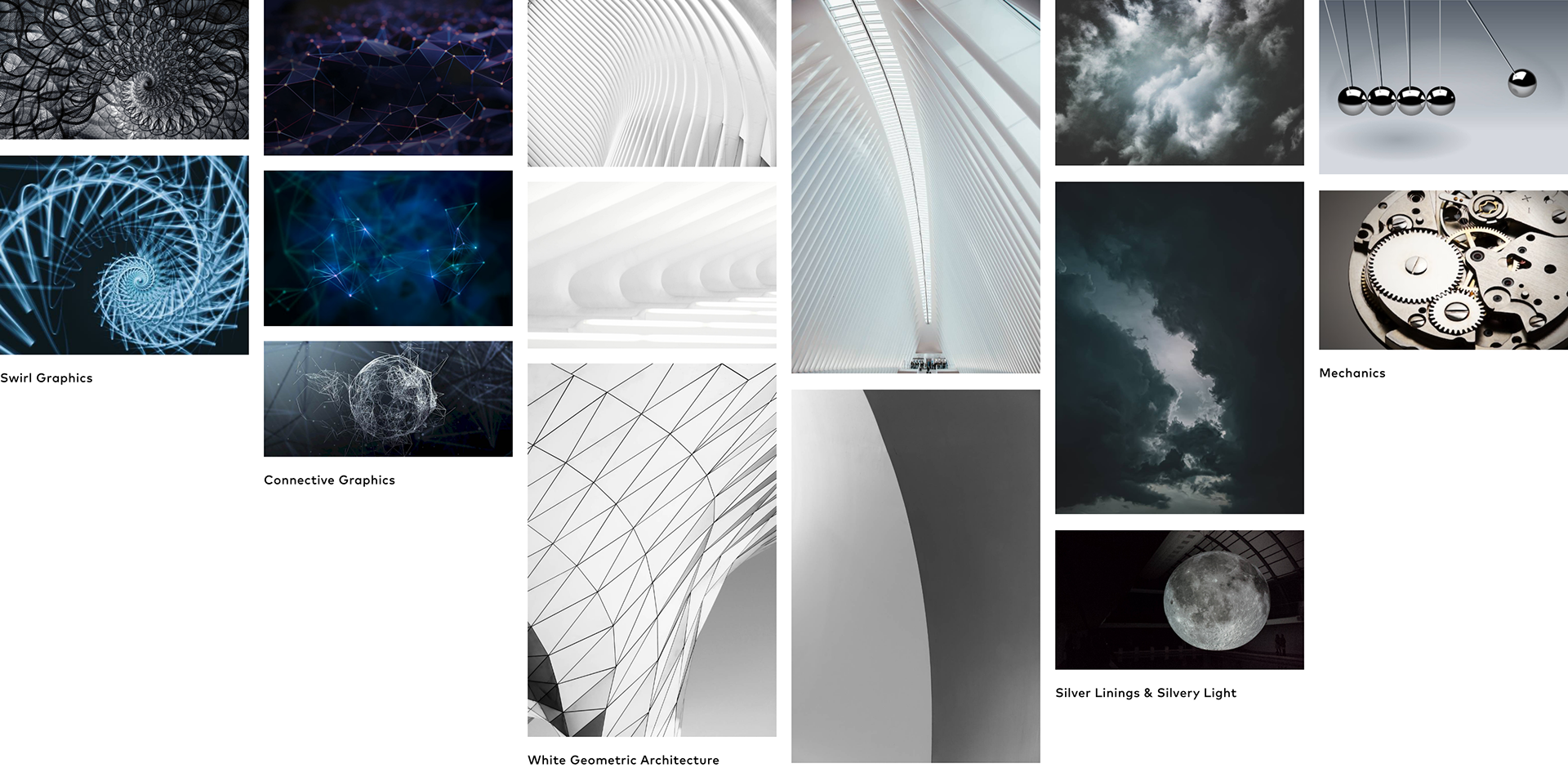
for the mood board, i focused on the two main concepts discussed in our brand strategy meeting—human nature and artificial intelligence. i curated images that embodied these themes, reflecting valkyrie's belief that merging human-centered solutions with complex science creates a silver lining for the future of humanity. key words that resonated with the client were elegant, polished, sleek, and luxurious. i gathered abstract representations of these ideas, creating a visual compass to guide the development of the brand guidelines.
brand guidelines: logo

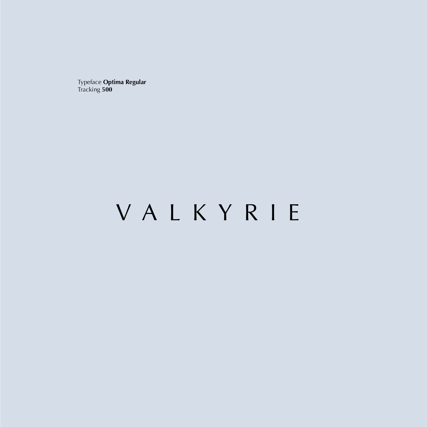
i updated the logo with the intention of seeing it featured on cars and merchandise. the client did not want to change the logo mark, but requested an update to the logotype. after exploring various typefaces, i selected optima regular with a tracking of 500. this sans serif typeface ensures legibility on physical objects while offering a unique feel, blending subtle serif-like qualities and character weight variations. this maintains a polished look, and the increased tracking creates an airy feel, adding a sense of elegance.

horizontal logo
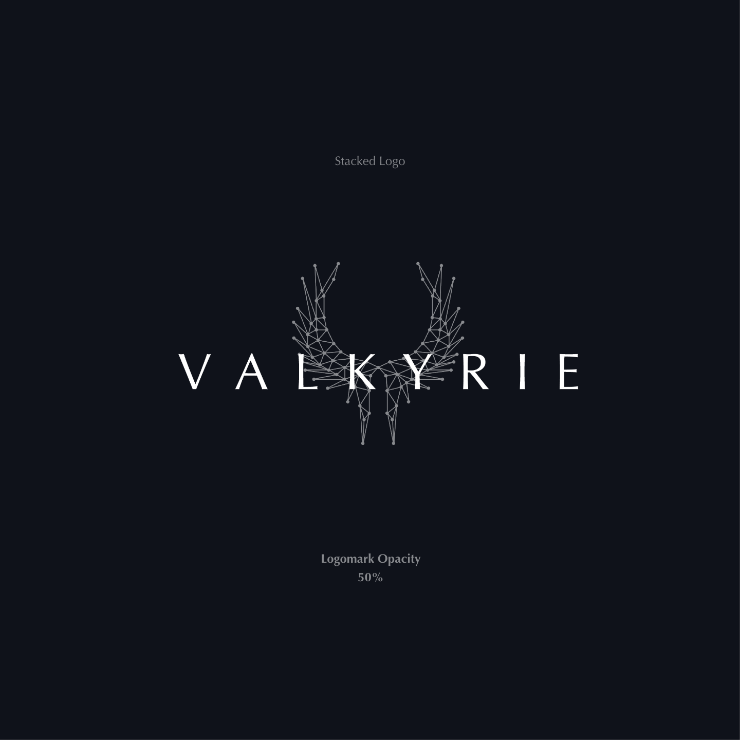
stacked logo
typesetting
brand guidelines: color palette
the client emphasized the importance of incorporating navy blue into their brand guidelines. to visually represent the contrasting concepts established in the strategy, i selected colors that complement and contrast each other. the primary color, silvery blue, symbolizes the silver linings in science and ai that the company offers. the other primary color, deep blue, represents the depth of humanity. navy blue, as the secondary color, adds saturation and serves as an accent throughout the designs.

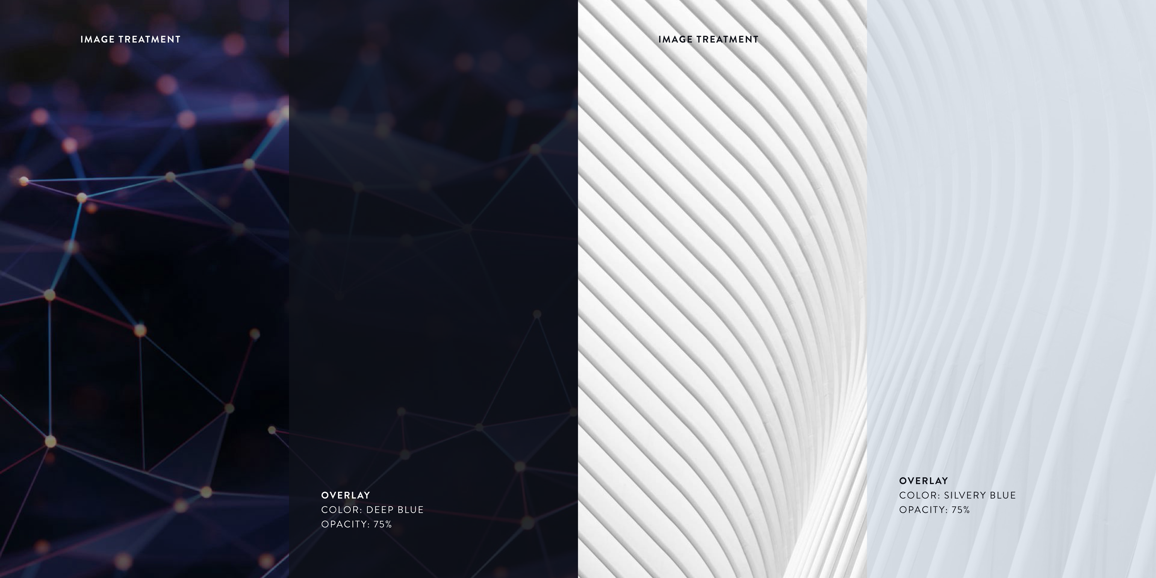
brand guidelines: image treatment
the image treatment applies to the interactive images on the website. by incorporating overlays, we create opportunities for micro-interactions, allowing users to discover more information through visual haptic feedback when hovering over an image. essentially, applying copy content over images enhances communication and indicates what users will find when they click through the image link.
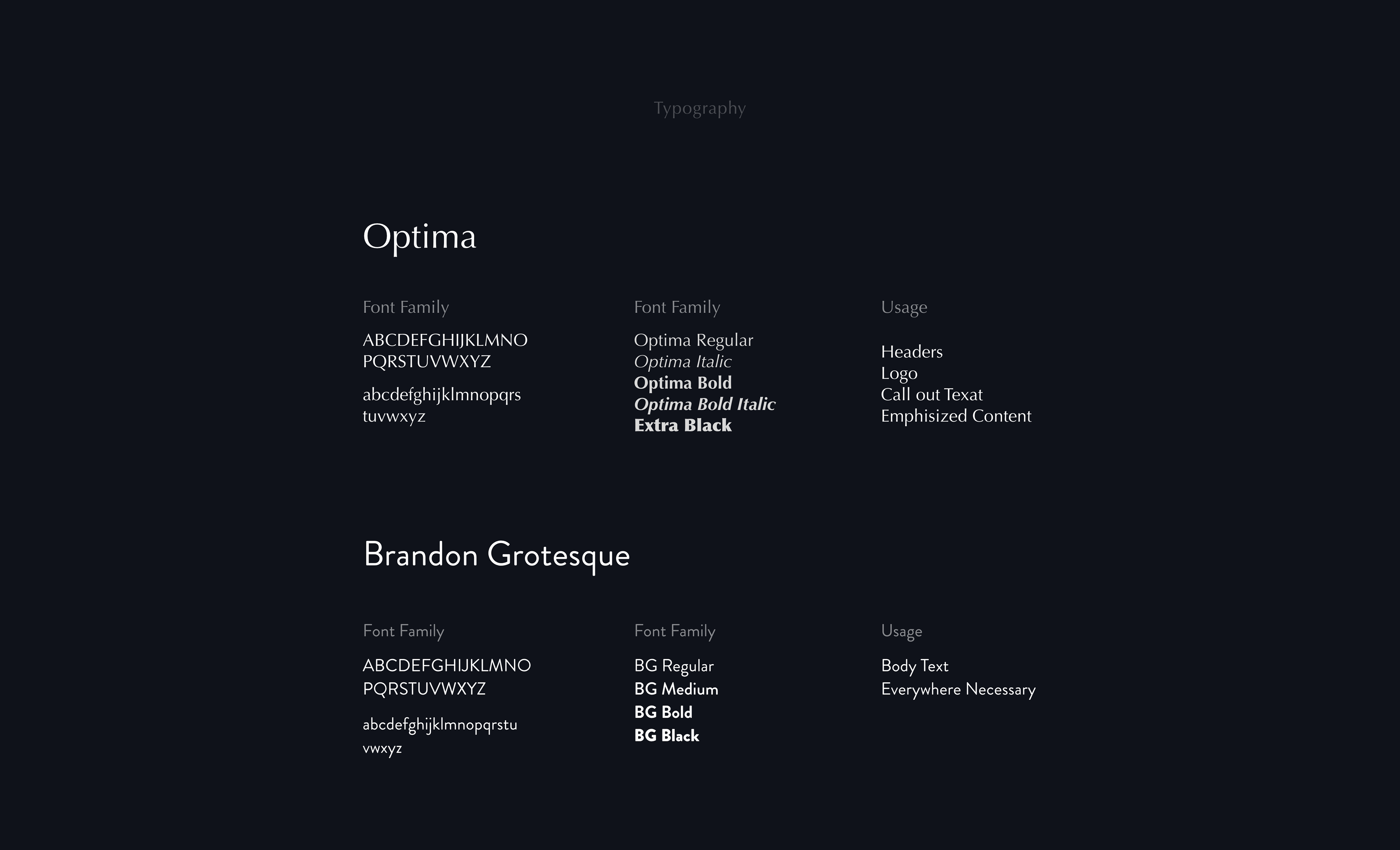
brand guidelines: typography
to increase uniformity across the design, i chose optima for headers, the logo, call-out text, and emphasized content. optima’s elegant and expressive character provided a refined visual impact. for body text and other necessary text elements, i used brandon grotesque. this typeface is uniform in form and pairs well with optima, offering a complementary contrast. brandon grotesque enhances legibility in body paragraphs and areas with heavy text, while its simplicity ensures the design remains clean and avoids visual overwhelm.
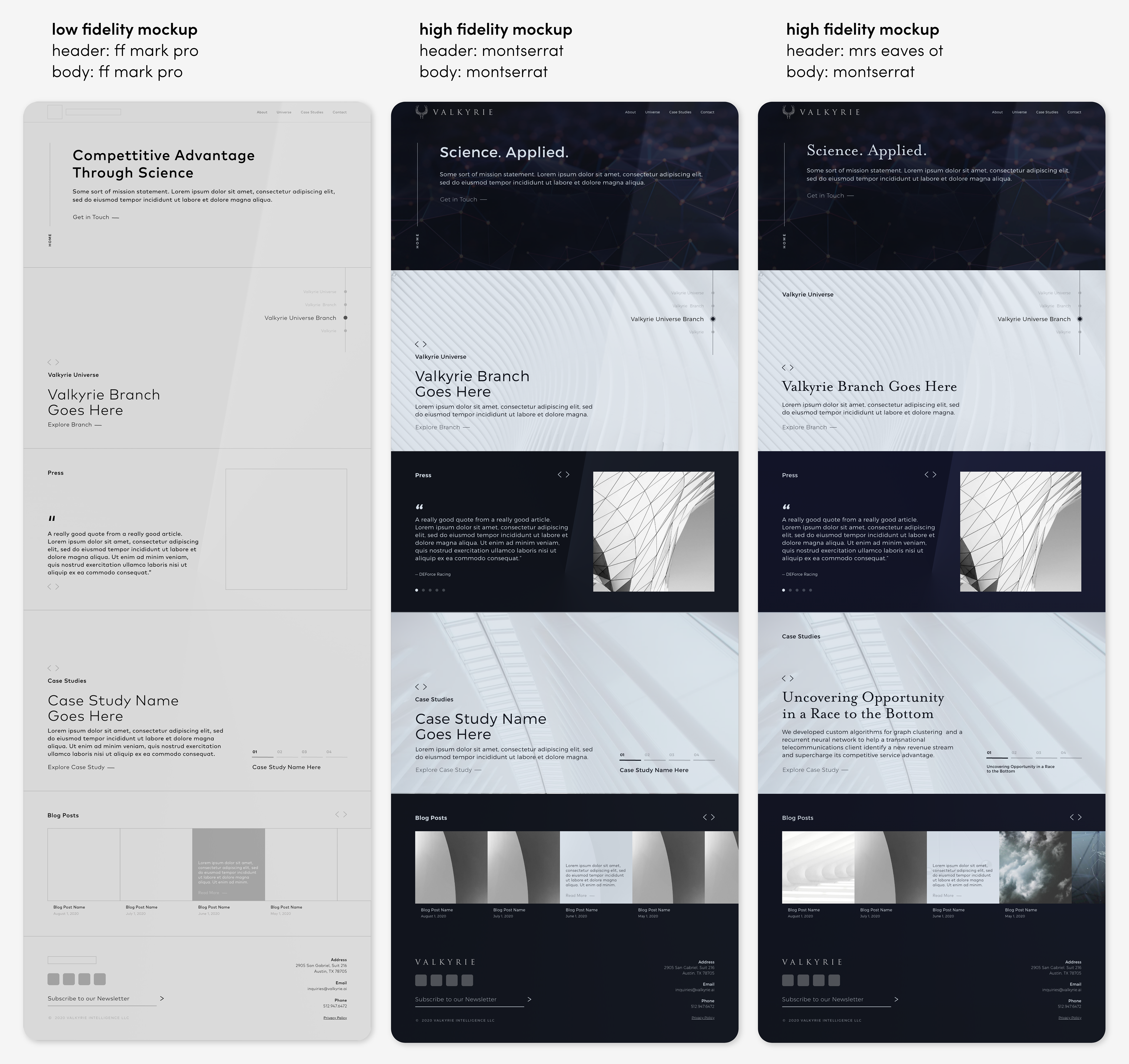
mockup & type exploration
i created mockups of the website's home page to explore the brand guidelines in action. the process began with a low-fidelity mockup on the left, which was used to map out the content structure without any branding elements. following this, i developed a high-fidelity mockup applying the brand guidelines and experimented with different typefaces—montserrat and mrs eaves ot.
with montserrat, i aimed for increased uniformity by using the same typeface for both headers and body text. however, this approach led to a sense of monotony and lacked character. conversely, with mrs eaves ot, i sought to introduce visual interest through varied typography, but it conflicted with the polished and sleek aesthetic that the brand strategy aimed to achieve.
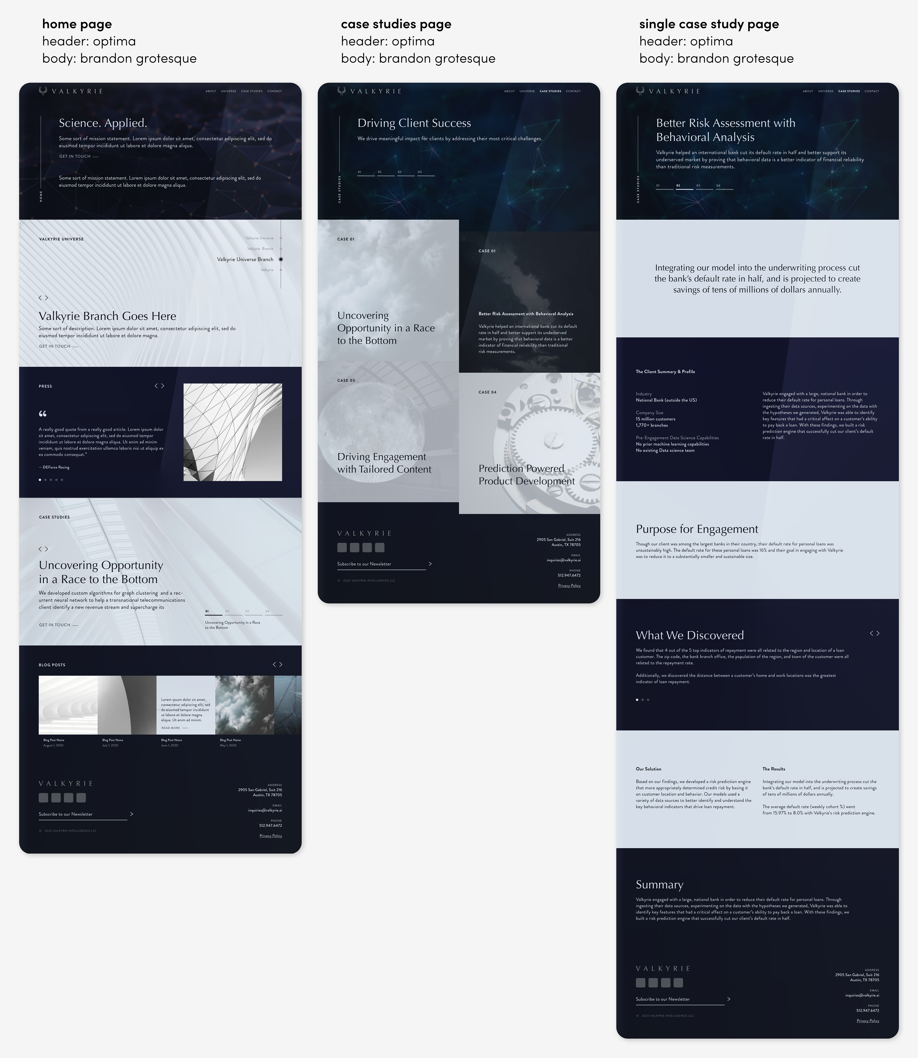
final mockups
using the existing copy content from their website along with the newly established brand strategy and guidelines, i created the final mockup images: the home page, the case studies page, and the individual case study page. i focused on visually representing the bimodal approach expressed in their strategy by alternating colors, employing a two-column grid system, and incorporating square forms. this design approach effectively illustrated the balance between human nature and artificial intelligence, central themes in valkyrie’s brand identity.
interactive prototype
the prototype is complete with three pages: the home page, the case study page, and the page for a single case study. to explore the clickable areas (hotspots) on the prototype, click on the image and you will see them highlighted in blue. this prototype provides an opportunity to navigate through different pages on the website and see the brand implementation in action. scroll and click through to experience the design and interact with the various elements.